Designing for accessibility: Our website
The Supporting Act
Today, most of us are aware of the accommodations that can be made in physical spaces to improve accessibility. But how can accessibility be addressed in the digital space? Given our commitment to challenging entry barriers into the arts, our open calls need to reach all those struggling with navigating the web, with language barriers, or with the complexity and length of application forms and guidelines. Rather than placing additional hurdles in the way of those who need our support, we should be helping them engage with our content and apply for our programs—and hopefully setting a good example to other organizations in the process.
Before designing our visual identity and website, WeTransfer’s Studio researched how these accessibility needs can be addressed in web design. As we’ve just launched the website’s second version, we felt this was a good moment to speak to design director Hugo Timm about the experience.
SAF: Hi Hugo! Looking at the role of creativity in producing accessible outcomes, there’s a pervasive stereotype that accessible design is plain—perhaps because initiatives working in the area lack resources. Did you struggle in dealing with this?
HT: The use of the word “plain” is interesting because it implies an able-bodied, normative point of view. But a significant part of the population may have trouble with designs that are confusing or impenetrable, as beautiful as they are. Understanding that, and not being reluctant to embrace simplicity as a useful element, was essential in our approach.
SAF: When discussing accessibility in visual language, we often talk about readability and vision impairments, or difficulties in focusing on and processing information. In your research, was there anything you found surprising, or wouldn’t previously have thought of as being related to accessibility?
HT: Apart from the technical aspects, it’s important not to think of design as just the visual layer that users see. Inclusive design starts way before—it has to do with how copywriters organize and write content, and how developers code the page. Everything is design.
SAF: The Web Accessibility Initiative’s Web Content Accessibility Guidelines (WCAG) are generally regarded as the most complete source on the subject, but are quite technical. Did you find any user-friendly resources approaching accessibility from the perspective of creative direction?
HT: The UK’s Home Office produced a set of posters that condense most recommendations in simple language, while make-it-accessible.com is a good resource that goes a bit deeper.
SAF: Looking at other social initiatives employing a strong creative component, it is easy to see their approach to design as visually “loud”—for instance, posters by social justice movements of the past, or social media campaigns of today. How do you find a way to make something expressive that doesn’t overwhelm the user?
HT: I think context is everything, depending on whether the goal is utility or disruption (or both). It’s also interesting to note that simple, direct, highly legible designs can be considered loud. Just think of a placard in a demonstration—communication boiled down to its essentials. Where it gets tricky is when this language of protest is co-opted by companies who choose the performance of virtue over anything concrete. With The Supporting Act, we are in a privileged position of having both a shared commitment and resources to build an inclusive experience, and with that comes the responsibility of being the change we want to see.
SAF: An accessible website has to function well when a user is not able to see it, which is an unusual approach to consider, as a sighted person. Did you test audio navigation? If you did, did this experience enrich your design process?
HT: Initially, we intended to create parts of the website that would operate differently in audio form, making it richer than the visual one—for instance, hiding bits of content that could only be heard and not seen—so the audio version wasn’t just a byproduct of the visual pages. But the more we looked into it, the more we realized that we’d be risking creating a terrible experience, which was a good moment to accept my ignorance.
Ultimately, the user of an audio website is expecting to interact with a website, and what I may judge as a dry, uninspiring experience, in which buttons, labels, and tags are all itemized, is exactly what users want. There was an amazing learning moment when we watched a visually impaired user navigate a booking website, and his audio settings were set to an incredibly high speed that I couldn’t follow or comprehend. It turns out you can scan a page with your ears as I do with my eyes.
SAF: What would your advice be to creative directors who want to adapt their usual processes towards designing for accessibility?
HT: I was uneasy about leading a project in an area that I’m not knowledgeable in. It’s one thing to not know things privately, but doing so in public, and getting things wrong as I inevitably do, can be uncomfortable. As a group, what helped us was to frame this as an opportunity to learn, test, and experiment. It’s never finished, and never will be.
Our website’s accessibility features
Throughout the design of our website, we tried to give as much attention to keyboard and audio navigation as to mouse interactions. As well as using simple and clear language in our messaging, blocks of text are broken in digestible chunks, aiding those with vision impairments and attention disorder, and those not fluent in English.
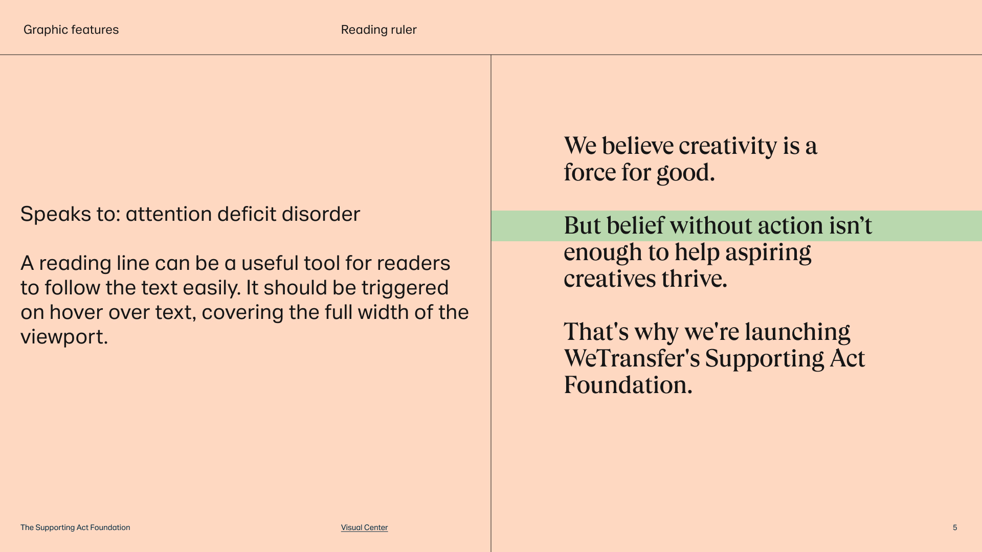
Typography is expressive, but various rules are followed to keep it legible, for instance not utilizing additional colors and keeping to a single type size. Separators organize content in a clear manner and indicate the beginning and end of paragraphs. In addition, a reading ruler is provided to help people follow the text. Buttons are oversized and generously spaced, so those with motor differences can click comfortably.
The main colors have been selected to offer contrast, whilst mitigating the effects of Irlen Syndrome, in which too much contrast over-stimulates the brain. Pale peach performs well by virtue of being a warm tone and reducing screen intensity, while the shade of black chosen avoids excessive contrast. Additional colors also follow accessibility standards, while a positive color scheme (black on peach) is always used, never a negative one (peach on black).